
*I frequently get asked questions about Data Science, so in the interest of helping as many people as possible, I’ve started this blog to answer those questions as simply as possible. This is a robust topic, and if you want a more in-depth discussion, please revisit my blog, where we will be going into greater depth at another time.
Data visualization matters because it brings complicated concepts to life. Use it to draw reasonable conclusions, create vivid presentations, and share discoveries from massive data sets. Here is what you need to know to take advantage.
Data visualization (DV) is an essential tool for data scientists and data analysts. It allows them to gather insights about buying trends, shared behaviors, and consumer wish lists. However, visualizing data is also helpful in the real world. Individuals and entrepreneurs frequently use it to sway public opinion, send targeted messages, or garner support.
What is data visualization? Why does it matter, and how can you use it? This article will answer those questions and more. Discover why businesses, organizations, and entrepreneurs use DV to demonstrate information and communicate concepts. Then determine how you can leverage data science and analytics to your advantage. Let’s get started.
Table of Contents
The Importance of Data Visualization
The Five Benefits of Data Visualization
#3. Develop Accurate Customer Sentiment Analyses
#4. Inspire People to Interact with Your Business
#5. Encourage Investors to Show an Interest
What Are Data Visualization Tools?
Top Tools for Data Visualization
Tips for Leveraging Data Visualization
Data Visualization Definition
The definition of data visualization is straightforward, and understanding it can help you realize its benefits. Visualizing large data sets is crucial because it allows others to grasp complex ideas. A data scientist can use various tools to reveal patterns within otherwise chaotic databases. This gives people a deeper appreciation for the information and its impact.
“The greatest value of a picture is when it forces us to notice what we never expected to see.” – John W. Tukey
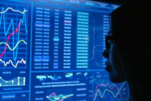
DV is an interdisciplinary practice dealing with charts, graphs, and other visual representations of complex information. It is a particularly efficient method of communicating a single concept to multiple audiences. This tool is also suitable for in-depth raw data analysis wherein the insights might not be apparent.
How Data Visualization Works
The data visualization process can be tricky and challenging. For one thing, multiple steps are required to transform raw data into recognizable images. For another, you must work with a data scientist to retrieve relevant information. Large data sets can contain overlaps needing to be sorted first.
Below are some of the strategies used to collate data and create visual tools:
- Decide a research question.
- Gather data from various sources.
- Clean the data for practical purposes.
- Choose a relevant chart type.
- Prepare the data for visualization.
- Develop charts, graphs, or other tools.
“Data visualization lets teams translate information into a visual context, making things easier for the human brain to understand.“
The primary goal of data visualization is to make patterns, trends, and outliers more apparent. This allows for more innovation, creativity, and better problem-solving and teamwork.
Data Visualization Examples
Many assume data visualization involves stuffy meetings with a button-down data scientist or analyst. However, the process and outcomes are far more exciting than that. In fact, some DV can help change the course of history by providing much-needed insights, uncommon knowledge, and straightforward communication tools.
Let’s look at some notable examples of DV from throughout history to get a better understanding:
- 1854 Broad Street, Cholera Outbreak Map helped medical professionals trace contagious disease transmissions and develop preventative measures for them.
- S. Government Interactive Budget uses data visualization to help U.S. citizens play an active role in the country’s economy and geopolitical future.
- Disney’s Gender-Specific Film Dialogue Study allowed producers and writers to revise scripts and props according to evolving social expectations.
These examples of data visualization demonstrate the power of organized information for particular audiences. Discover why or how people do things, where certain aspects of our culture came from, and when we can expect different outcomes. Gather data and create visual aids to help spread the message.
DID YOU KNOW: A company called Selfiecity uses data collection and analysis to help marketers visualize trends in social media behaviors.
The Importance of Data Visualization
Some industries find data visualization especially valuable, although any field can benefit from it. Visualizing data is most common in business, finance, social work, and science. The tailored representations of information help groups make educated decisions regarding policies, marketing, or otherwise.
Data visualization provides a tremendous boon to aggressive businesses and revolutionary organizations.
“It helps executives recognize hidden trends before the competition, allowing for more meaningful innovation.”
DV can also reveal errors in the company’s data, policies, or practices for better performance and public perception.
Data patterns define how experts collect the data and determine the details of visual aids. The primary function is to specify the required fields for extraction, examination, or presentation. These patterned data sets can be semi-structured, structured, accessible for study, or indexed in a database. They help make complex data available for multiple applications, future research, and combining with new concepts.
Making sense of various data patterns allows teams to make more profitable decisions in less time. Furthermore, a data scientist can help draw attention to relevant information within large data sets. This can help teams discover red flags indicating the success or failure of various campaigns.
The Five Benefits of Data Visualization
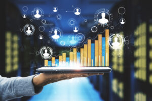
Data visualization is good for more than painting pictures of complex concepts. It can also help businesses charge ahead of the competition with relevant, timely, and accurate information. Make better business decisions with precise data analysis by an experienced data scientist.
A data science team can provide structured feedback to identify specific correlations. This allows companies to determine connections or forge relationships with higher probabilities and more profitable outcomes. Data visualization creates a window for exploration opportunities. Also, you can develop automated systems with contextualized data for a convenient, zoomed-in view.
Here are five other benefits of using data visualization:
#1. Support Visual Learning
The human brain processes visual information more than anything else. However, learning styles can vary depending on countless factors. Some people understand concepts better with kinesthetics, while others require auditory instruction. Meanwhile, nearly 65% of the global population intakes information from visual stimulation. That makes data visualization especially crucial for widespread comprehension.
The standard spreadsheet era has passed, paving the way for more robust and diverse data analyses and presentations. Modern technologies such as AI and machine learning help data scientists transform facts into appealing, interactive charts and graphs.
#2. Analyze Data Faster
Collating, cleaning, and analyzing massive data sets can be daunting and time-consuming. Fortunately, people notice and comprehend visual content faster than text. In fact, research shows the average person can process about 10 million bits of data per second through the retina. Data visualization taps into our innate learning styles to help us make sense of the bigger picture.
Take advantage of your brain’s biological sweet spot with tailored data visualization tools. Build statistical models, form complicated algorithms, and create displays that motivate or educate.
“Rise above the noise by presenting the most relevant and accurate information quickly.”
#3. Develop Accurate Customer Sentiment Analyses
Understanding your target audience is essential to business ethics, operations, and policy-making. It’s also crucial for developing effective marketing campaigns and having meaningful interactions with stakeholders. Determine and analyze customer sentiments with data visualization strategies. This can help you explain various changes to teams before implementation.
Ask a data scientist to help you create parameters for data visualization projects. They can help clean the data to prevent oversights, mishaps, and misunderstandings. Reveal the true nature of your target audience to the staff so they can provide satisfactory customer service and compelling sales pitches.
#4. Inspire People to Interact with Your Business
Businesses that use data visualization to pinpoint customer sentiments or market trends often enjoy increased sales and traffic. Their customer base feels heard, cared about, and catered to. DV also enhances metric capabilities and makes light work of goal tracking. Implement feedback rapidly to stay ahead of industry trends and become an authority in your field.
Data visualization helps you create the following tools for more meaningful interactions with stakeholders:
- Thought-provoking polls
- Educational image carousels
- Demonstrative charts
- Explanatory graphs
- Contrasting concept maps
Use data visualization tools to identify trends, discover mysterious patterns, and bolster brand recognition. Or build graphic visual content to share information, inspire involvement, or encourage industry revolution with data to back it up.
#5. Encourage Investors to Show an Interest
Excellent data visualization indicates you have done adequate market research. It also reveals hidden patterns in consumer behaviors and buying power. Data scientists can even help demonstrate industry projections, possible causes, and potential variables. This could garner much-needed interest from motivated investors looking for promising acquisitions.
Assuage concerns about a company’s future or a concept’s public acceptance with precision data visualization. Then create a template for project proposals to further streamline communication. Or use real-time data sets to continually update information regarding specific metrics.
DID YOU KNOW: Many teams require visual aids in business proposals and presentations. Some also use data visualization software to share information instantly.
What Are Data Visualization Tools?
Data visualization tools are essential to data science and analysis because they help teams stay organized and updated. These intuitive software applications can render data visually for convenient consideration. Usually, the renderings are graphs, charts, heat maps, and timelines to foster an in-depth understanding. DV tools also help share information across multiple platforms and diverse audiences.
Top Tools for Data Visualization
According to Forbes, several data visualization tools are available for data scientists and analysts. However, each option offers different pros and cons depending on your goals. The best software for DV will provide adequate data collection instruments, ample analysis resources, and multiple implements for creating visual content.
Unfortunately, project parameters and requirements can shift instantly. Still, you can stay abreast of the changes with high-performance data visualization software. Perhaps consider one of these:
Talk to a data scientist for more information on the most trusted data visualization programs and apps. They can help match the software to your goals and ensure efficient data collection.
“Make the most of your efforts with data-backed imagery that tells a story.”
Tips for Leveraging Data Visualization
Enjoy multiple data visualization benefits when you leverage the tools to your advantage. This means choosing the best charts and graphs for each project or audience. It might also look like using banal patterns and metrics for layouts in the beginning. In any case, let your data tell compelling stories with evident cues and contextual clues.
Many teams use size, colors, and shapes to help viewers visualize data during strategic planning. This is important because it allows people to think about values and concepts without additional prompting or prodding. Furthermore, you can follow these five steps to enhance your data visualization powers:
- Decide what you want to see. Don’t collect or analyze data sets without knowing what to look for. Discuss the options and priorities with your team first.
- Determine a suitable audience. Create visual content based on what your users want or need. This will help ensure your data goes to good use.
- Gather data from multiple sources. Avoid restricting your research with too-tight metrics and unrealistic expectations. Double-check sources, and use plenty of them.
- Hire a data scientist. Allow experienced data scientists to collect, clean, and collate your data before developing visual aids. They can help remove mistakes and reveal hidden patterns.
- Ask for feedback from staff. Request insights from your team before using data visualization tools. Then have a data scientist implement the most effective approach.
Conclusion
Data visualization plays a fundamental role in the modern world. It gives businesses unique insights into consumer behavior, competitive curves, and market trends. However, the best part is that DV allows teams to demonstrate complex concepts in a digestible way for multiple purposes.
It’s important because it helps people understand, share, and debate crucial information. Data visualization enhances communication, fosters meaningful interactions, and reveals evidence. Use it to your advantage for boosted industry authority and increased profitability.
 About the Author
Tiffany Perkins-Munn orchestrates aggressive strategies to identify objectives, expose patterns, and implement game-changing solutions with an agility that transcends traditional marketing. As the Head of Data and Analytics for the innovative CDAO organization at J.P. Morgan Chase, her knack involves unraveling complex business problems through operational enhancements, augmented financials, and intuitive recruiting. After over two decades in the industry, she consistently forges robust relationships across the corporate spectrum, becoming one of the Top 10 Finalists in the Merrill Lynch Global Markets Innovation Program.
Dr. Perkins-Munn earned her Ph.D. in Social-Personality Psychology with an interdisciplinary focus on Advanced Quantitative Methods. Her insights are the subject of countless lectures on psychology, statistics, and real-world applications. As a published author, coursework developer, and Dissertation Committee Chair, Tiffany still finds time for family and hobbies. Her non-linear career path has given her an exclusive skill set that is virtually impossible to reproduce in another individual.


4 Responses
Appreciating the valuable insights on why data visualization is crucial. Thanks for sharing!
Everything is very open with a very clear clarification of the issues. It was definitely informative. Your website is very useful. Thanks for sharing!
“Get paid”: A huge number of people want to “get paid” for doing what they love. This is a hook that people can’t resist.”
안전놀이터
Do good and good will come to you. 웹툰순위